New Spring = New Jeans
5/3/05
Crisis! I've been trailing the stores to track down a pair of hot looking jeans for the spring. Nothing fits - it is such a disaster. After desperately eeling into pair number 14 of my trial stack, I finally gave up. "Look, if I bend or sit down, this pair shows my underwear!" I complained to the shop assistant. "Oh, you aren't wearing a pair of hipster thongs or briefs already?" she politely smiled. I'm confused. Hipster what?
Low cut jeans should be priced down - God knows how much fabric they save on revealing people's bellies and cracks. It is a disgusting fashion. In Virginia, law makers wanted to fine the low cut riders:
The bill, which would have slapped a $50 fine on people who wear their pants so low that their underwear is visible in "a lewd or indecent manner", passed the state House on Tuesday but was killed by a Senate committee two days later in a unanimous vote.
Anyway. To avoid the embarrassment of looking horrible while trying out pants in the stores downtown, I went online to search for a better way of finding good jeans. It turns out I'm not the only one having a hard time with this:
"The average woman tries on nine pairs of jeans before finding a pair that fit..."
"For example, one study reported that the average woman in the U.S. tries on 21 pairs of jeans before making a purchase, while men try on an average of two pairs of jeans."
"The average woman tries on 15 pairs of jeans before buying"
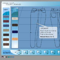
I found a great jeans tool at the Interactive Custom Clothes Company. They'll let you design your own jeans, and afterwards, they'll apply your measurements to the model. IC3D guarantee that your pants will fit, or you may return them. Choose your shape, fabric, details.. I love this. No more tiny dressing room or bitchy assistants.
Flash video
5/3/05
Flash video/film is becoming quite the thing to do!
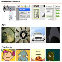
There is a Flash Film Festival at the FlashForward 2005 (San Francisco, April 6-8). There are 15 categories (!) - Application, Art, Cartoon, Commerce, Educational, Experimental (exciting!), Game (I wish Madison would get her act together and submit some of her stuff), Motion Graphics, Navigation, Original Sound, Story, Technical Merit, 3D, Typography, and Video.
At first, it might seem excessive to have so many categories. But I think it is the right way to go - this way, people with excellent story telling skills have a chance to get through even if their technical skills aren't the best.
Some of my favorite finalists:
The Interactive Church Music Player, which lets you decide tempo and choose the dynamics for the choral voices while you look at the music score.
The pieces by Abnormal Behavior Child - especially Rooms. She could have toned down the flashing, though! Perhaps it was meant as a cool effect, but it does nothing but aggravate you after a while.
Osman Dinc's portfolio is amazing. I love his illustrations - and the way he lets you browse them!
Linkdup
5/3/05
linkdup , my new favorite website? A collection of guys collects a collection of links:
We've been in the business for a while, and so hope we can separate the good from the bad.
I wouldn't say that *all* these sites are "good", though... Browsing through the Digital Magazine selection at linkdup, for instance, I found that most sites make use of the flash "page flipper" for their layout.... while others skipped the flash all together but kept the pages. Original? You tell me.
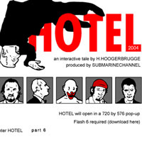
I liked Fused Magazine, though. And I found submarinechannel.com's interactive tale Hotel very engaging. Give it a read!
Sometimes, you might just find some fun stuff behind a link.
Beacon Street Girls
5/3/05

Are girls aged 9 -13 too old for toys, and too young for boys? Do they need their own stuff? B*tween Productions, Inc thinks so, and launched this interesting Web site to complement their "Beacon Street Girls" books. The Beacon Street Girls are 4 fictional girls from Brookline, a suburb of Boston: Avery, Isabel, Charlotte and Mauve.
I'm so curious about how these characters were developed. Intended to be role models for young girls, they teach "socially responsible values in a delectable hot fudge sundae of fun and friendship." The Web site design is sugar sweet and upbeat in tone. All the characters have their own sections, with a "this week in my life" section. Avery's is a blog, of some sorts. In one post, she asks:
"Question of the week: Why do people call short people cute? It's really annoying. We don't like to be called cute. It makes us feel like windup toys!"
Well, I hate to say it, BUT... aren't these character "cute"? They are all slim, wonderfully dressed, some equipped with almost "adult" jewelry. Katani, at this young age, seems way too vain and writes in her "this week in my life" section that before she goes to bed, she'd like to "try new mud masque". Did her parents buy this stuff for her? Katani even has her own design line named K-girl (Wow. That's some pressure right there, if you're 12. Why don't YOU have your own design line?).
After some browsing around the website, these Pollyanna characters all began seeming like the same person to me. They all have the same smiles, eyes, noses, and faces (although they have different colorings). Sigh.
Actually, it was heart breaking. At the Web site's surface level, none of these characters seem to have any of the problems my peers and I experienced when we grew up. Has the world changed this much? Am I already out of touch..?
In my class room when I was 12, fat Anne wanted to be an opera singer. We all laughed, rolling our eyes. I was skinny and tall: they boys once locked me inside the bathroom when the school bell rang... I could escape through the keyhole, couldn't I? There was Celia, with the black, shiny hair and blue eyes, who grew perfect breasts before any of the rest of us. After Phys Ed classes she'd proudly flaunt them in front of the mirror in the girls wardrobe, shaking them from side to side so we'd have the opportunity to see precisely how big & bouncy they were. Wearing socks and toilet paper in our own (otherwise empty) bras, we publicly adored her and silently hated her. Then there was Lina, who claimed she was born a boy! Could girls be born boys?? We didn't think so. Appalled and disgusted, we kept her at a distance, except when she brought us goodies (which we inhaled and then ditched her). We were mean little bastards and proud of it.
Not exactly hot fudge sundae, or what? Do we need fudge and upbeat to teach young girls values?
I got curious about where these characters came from, and found an online interview with Addie Swartz, the CEO of B*tween Productions. Here is what she said:
We interviewed a healthy cross-section of girls from different socio-economic groups. We met them in after-school programs, at Boys and Girls Club centers, and at soccer games.They provided great ideas and input about what the characters should be like — even how they should look and dress. School emerged as a common theme among the girls we spoke with. From this field research we created composite characters.
So I have to wonder. Did these characters emerge from a blueprint of the average young American girl's fantasies? From the imaginations (or aspirations?) of their parents? Their teachers? Are they the real young American women to be?
Keeping track
5/3/05
I'm always buried in email, and all the replies I'm getting from the dating site listings I made for Madison aren't helping!
I made a mailbox just for my life as Madison's matchmaker. Mark Hurst, the GoodExperience guy, has a great report on living with the email torrent.
Come to think of it, perhaps Tinderbox might be a great help in organizing Madison's potential new dates? I'll keep you posted.
O'Reilly Emerging Technology
5/3/05

Another conference I'd love to be at... The O'Reilly Emerging Technology conference, March 14-17, 2005, San Diego, CA
The slogan is Remix: your hardware, your software, your media, your world.
Many interesting sessions here. Like Reinventing Radio: Enriching Broadcast with Social Software:
How could you enhance a one-to-many national radio station by building in the many-to-many-style interactions of Flickr or the weblog community? How might lessons from social software further blur the distinction between listeners and broadcasters by pushing interactivity beyond the phone-in or the online poll?
Some of the session doesn't have descriptions yet, but sound fascinating, like this one titled Folksonomy. A quick google search gave me a broad introduction to the term, and I found some weblogs to watch as well:
Thomas Wander Val (who coined the term folksonomy)
Gene Smith (very interesting weblog)
Marry Blaire
5/3/05

I followed a link to Marry Blaire and could hardly believe my own eyes. Blaire wants to get married, and asks us all: Do you know my husband?
I wonder, why is Blaire not using an ordinary dating site like the rest of us? Perhaps it is all the attention she is attracting by doing this on her own? She has so much faith in her site that she is even making space for a few other dream guys/girls to ask for love!
Actually.... would Madison like Dave? She certainly fits into what he asks for - a woman with "some kind of education".. (sorry, could not resist!)
AID
5/3/05
Getting help to Asia matters a lot. It's hard for the blogosphere to know what to say. Please do what you can.
I was moved by a phone call on cable news from some American tourists, a family that had been enjoying a luxurious beach vacation when the earthquake hit. They have rolled up their sleeves and pitched in, working long days to clear debris.
I was impressed by the Amazon donation page -- not just because they replaced their home page, but because they show you -- right up front -- what they've collected and how many people have already donated. (More than $4M already!) Every time you refresh the page, the totals edge higher.
It is impressive in so many ways. You can see what's happening right now. You do something -- and you can see the result right away.
Oxfam's news page has a great sense of immediacy, too. Not just accounts of immense needs, but also exactly what they are doing right now. "Hired a ferry in Trincomalee... Aid flight leaves at 2.30pm GMT for Sri Lanka and Indonesia - the plane is scheduled to arrive at 10.30 on Thursday." Medecins sans Frontieres has the same idea: don't just show us the enormity of the disaster, show us what to do, and what is being done.
Forgot the Christmas cards again?
5/3/05
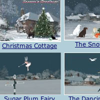
- do not fear. You'll be thrilled to know that finally, thanks to a real artist, sending interactive e-cards won't make people think you're a cheapskate, nor will it make you look cheesy!
Jacquie Lawson has done something incredible. She has created a subscription based e-card service for those in need of a proper card to send for special occasions: there is NO advertising, no promises of freebies or anything else. Don't be fooled by the unclean website design. The cards are delightful - surf through her site and click on the previews of those cards - you'll want to subscribe in a snap!
Especially if you (like me..) haven't done your Christmas card duty...
I'm so curious about her business model. She has managed to give her customer a feeling of something exclusive: her subscription renewal rate is 70 %. That is a high number, given that there are only 47 cards on her site, each card cannot be sent to more than some ten thousand people, and she only adds about 10 new cards every year.
I think I'm in trouble...
5/3/05
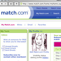
Oh, what have I done? Madison absolutely hated that guy I sent over to have lunch with her yesterday. She rejected him flat out. But he is still hoping for a second date!
Madison,sorry for both of us that things were rather staid yesterday on our meeting. it's too bad, but that's the way it often works, as each person has a lot of getting used to in terms of three-dimensionalizing the other, particularly in a short date with two somewhat shy people. I'm taking a philosophical view on this-- where you see a person for the first time to evaluate them, and it's often very formal, then a visit or two later, you're both comfortable. so i always offer a second date, if you accept. My experience is that it is much more relaxed and fun. Let me know, Madison. I'll drop by the store again.
Fred.
How pompous! And stuffy.... he must be desperate for attention.
What do I do now? It is all my fault - I set both Madison and this guy up. But for Madison's sake (and mine, if she ever finds out I'm behind this!) - I must get her out of this NOW. Hopefully he'll see the exit sign in this message. I just sent an email:
Fred, thank you for taking the time to see me. But the truth is that there is no chemistry between us. I appreciate that you came to see me, but a second meeting is NOT in our future. I don't want to meet you again, nor do I want to see you at my workplace. Best of luck - I hope you will find the right person for you. Madison.
Clear enough? Phew. Close call.
Good Experiences
5/3/05
Oh! This looks incredibly interesting! A conference on what makes a good experience. About time - how come I didn't know about this before?
The participants are divided into tracks. Some visit a school, others the market, some the street, and some lucky attendees will go to the museum, all on the look-out for good experiences.
I really want to go - think about all the ideas you'll bring home and implement in your designs. Most of our clients at work hire us to design their web catalogs - studying how people buy and salesmen sell at markets might give valuable insights in how interactions on a website could be designed. Perhaps I could get this trip sponsored...
Success!
5/3/05
He wrote back! He'd like to see her for lunch!
But how do I convince her to do this? I already asked her if she had plans for lunch tomorrow and she said she was free. The problem is, if I tell her that she has a date, she'd probably not agree to go. How do I make this happen... I need to think, fast.
And - come to think of it - I should probably find her a few other matches, just in case. Better safe than sorry. Madison is extremely picky.
Will this work?
5/3/05
I decided to do the dirty work for Madison:
Dear NewToThis72, I came across your profile today and thought you looked interesting. Are you really into computer games? That's my passion, too! One day, I'll be a game designer. But I'm not there just yet; I'm working at a bookstore at the mall for now. What's your favorite multi-player game?I'd love to hear from you. Please have a look at my profile and let me know where you'd like to meet!
Madison
Online dating
5/3/05
I'm having so much fun trying out different dating sites!
It would have been so much more fun to do this together with someone - but Madison isn't game. I've tried hard to convince her -- these sites are getting better and better all the time. Obviously there are some flaws here and there, and outrageous claims, too. At Match.com you can take an attraction test to see who you'd be attracted to, and who'd be attracted to you. So far, I'm not seeing exactly how that can be assessed in pure data, but ... it is interesting.
I spent some time creating some profiles on different sites this morning. When I got back from lunch, I had to spend nearly an hour sifting through my inbox! So what if some of them aren't quite what one is looking for...? There are bound to be one or two you'd want to meet up with.
I'm emailing with at least 7 guys right now - it is nice to have some choice! Come to think of it, Madison's problem is that she is too picky... When she was over at my place last week and talked about this, we did a few searches on Match.com. She didn't like anybody! I bet if she just met some of them face to face, she'd think different...
Interface with overlay navigation
5/3/05
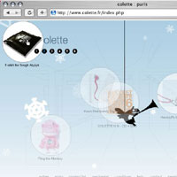
The design team at Colette is trying to do something interesting - they have built an unusual interface to their web catalog. There are drag-able items layered on top of a sketch of a room - not that interesting in itself - but when you roll over the items, one of item on each screen will bring a transparent layer over the room sketch. They haven't taken this further, which is disappointing. But there is an idea in there somewhere... imagine using transparent layers as a way of navigating, up a level, down a level, different places..... wouldn't that be neat?
Do you know of any sites that use overlays to help visitors navigate? I'd love to hear from you...
Innovation
5/3/05
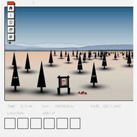
Since I graduated last spring and was hired in August - I can't enter the student contests anymore. That doesn't mean I'm not watching them, though. You can learn so much about new trends by paying attention to how students design. But sometimes, the contests drop off the face of the earth.... for instance, what happened to Macromedia Student Contest Design?
"Our first student design contest brought in more than 1,500 entries and was an amazing success," said Pat Brogan, vice president, solutions, Macromedia. "Macromedia wants to take an active role in providing software and support to the next generation of Web developers as they learn their craft, and the Student Resource Center and contests are one way to accomplish that mission."
What would this guy say today.. If you browse Macromedia's Innovation Program now, you won't find open contests nor any recent contest. What happened?
Anyway - there are still some interesting galleries to browse. My favorite is Arthur Roper-Newman, who writes:
"The site was originally inspired by the way ant colonies work, where orders derive from the base up. The many stories I had written became the basis for events within the colony, and it just grew from there. I hope this ongoing environment inspires people or makes them think when they view it."
Fireworks by John Pnim
5/3/05
I was just reading the latest fiction on fray.com when I came across Fireworks by John Pnim. The author of this story writes with a disturbing intensity about the war in Iraq. The characters include: a paramedic student, a woman who has just attempted suicide (her husband was killed in combat two months earlier), and a nurse who has a husband still fighting in Iraq.
The nurse, who believes that the war is just, tries to comfort the suicidal woman by telling her that her husband died doing "good work, fighting for freedom." The woman is livid when the nurse says this because she hates the war and President Bush who she blames for the death of her husband. She spits on the nurse. The nurse sees the patient as "imbalanced" and the patient sees the nurse as naïve.
Meanwhile, the paramedic stands by, letting all of this all happen, paralyzed into silence by helplessness and a fear of adding to the conflict between the nurse and the patient. He thinks that the nurse is wrong, but he knows that no amount of convincing is going to sway either woman's viewpoint.
This story could really be an analogy for my relationship with my parents. Aside from short, awkward phone calls on holidays and birthdays, I haven't spoken to them in years. I think that just like the paramedic, our past has been so filled with conflict that it's easier for us to not talk than to talk because we are afraid of opening up those old wounds that just never heal.
The other day, I was at Starbucks with my friend Madison, drinking a white mocha latté when these two guys came into the coffee shop. One of them was tall with dark hair. His eyes and nose gave him a rooster-like appearance. The other was more handsome, well-built, rugged, and blonde. They ordered their drinks and sat down at the table right next to us. I guess that one of them recognized her from the bookstore and immediately, both of them started to flirt with her. I could tell that she was really enjoying the attention.
Since the conversation evolved mostly around Madison and the bookstore, my eyes and my mind started to wander a bit. I noticed two young parents with a tiny baby girl sitting in the corner. They were goo-goo-ing and goo-gah-ing over her. It made me think back to my own parents—I wonder if they were ever excited to have me around.
Fireworks
5/3/05
I was just reading the latest fiction on fray.com when I came across Fireworks by John Pnim. The author of this story writes with a disturbing intensity about the war in Iraq. The characters include: a paramedic student, a woman who has just attempted suicide (her husband was killed in combat two months earlier), and a nurse who has a husband still fighting in Iraq.
The nurse, who believes that the war is just, tries to comfort the suicidal woman by telling her that her husband died doing "good work, fighting for freedom." The woman is livid when the nurse says this because she hates the war and President Bush who she blames for the death of her husband. She spits on the nurse. The nurse sees the patient as "imbalanced" and the patient sees the nurse as naïve.
Meanwhile, the paramedic stands by, letting all of this all happen, paralyzed into silence by helplessness and a fear of adding to the conflict between the nurse and the patient. He thinks that the nurse is wrong, but he knows that no amount of convincing is going to sway either woman's viewpoint.
This story could really be an analogy for my relationship with my parents. Aside from short, awkward phone calls on holidays and birthdays, I haven't spoken to them in years. I think that just like the paramedic, our past has been so filled with conflict that it's easier for us to not talk than to talk because we are afraid of opening up those old wounds that just never heal.
The other day, I was at Starbucks with my friend Madison, drinking a white mocha latté when these two guys came into the coffee shop. One of them was tall with dark hair. His eyes and nose gave him a rooster-like appearance. The other was more handsome, well-built, rugged, and blonde. They ordered their drinks and sat down at the table right next to us. I guess that one of them recognized her from the bookstore and immediately, both of them started to flirt with her. I could tell that she was really enjoying the attention.
Since the conversation evolved mostly around Madison and the bookstore, my eyes and my mind started to wander a bit. I noticed two young parents with a tiny baby girl sitting in the corner. They were goo-goo-ing and goo-gah-ing over her. It made me think back to my own parents—I wonder if they were ever excited to have me around.
MSN Spaces
5/3/05
With MSN spaces, Microsoft have caught onto blogging for real. I have been following their employee bloggers (Hi Scobelizer! ) with interest - they seem to have been granted a license to do pretty much to do and say what they want on their blogs. Last week, I discovered that even some of their recruiters keep blogs - Heather has a very interesting post about why recruiters don't blog - and Gretchen and Zoe 's blog Technical Careers @ Microsoft contributes to giving Microsoft a fun, warm image. Looks like they love their jobs!
You've got to wonder though... how much time of their work days do they spend on blogging?! Heather mentions that "A blogger that is committed to not only post regularly, but also to read other blogs, write comments, track links and respond to people that contact you (for me, I estimated this as 30 min to 2 hours a day)."
Wow. Wish I'd get paid to blog my job, too..
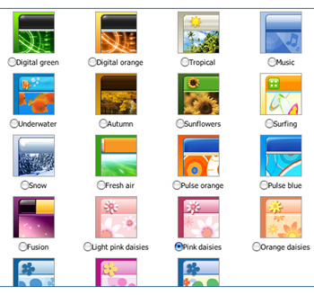
Anyway - I was interested in seeing how their spaces for people like you and me was designed. MSN Spaces offer a lot - except control over your templates! Power to the user here translates to publishing power - not design power... Check out the screen shoot - their templates are pretty cheesy. Microsoft isn't known for pretty, but they didn't need to compensate for this with what seems to be aimed for color hungry teenagers... I took a test drive and here is what my MSN blog ended up looking like.
... .perhaps I should keep this blog, and post anonymously so I can set Madison up for a joke? Come to think of it, she'd love these happy looking templates - just her style.

