Wednesday, December 1, 2004
Interface with overlay navigation

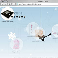
The design team at Colette is trying to do something interesting - they have built an unusual interface to their web catalog. There are drag-able items layered on top of a sketch of a room - not that interesting in itself - but when you roll over the items, one of item on each screen will bring a transparent layer over the room sketch. They haven't taken this further, which is disappointing. But there is an idea in there somewhere... imagine using transparent layers as a way of navigating, up a level, down a level, different places..... wouldn't that be neat?
Do you know of any sites that use overlays to help visitors navigate? I'd love to hear from you...
Wednesday, November 24, 2004
Innovation

Since I graduated last spring and was hired in August - I can't enter the student contests anymore. That doesn't mean I'm not watching them, though. You can learn so much about new trends by paying attention to how students design. But sometimes, the contests drop off the face of the earth.... for instance, what happened to Macromedia Student Contest Design?
"Our first student design contest brought in more than 1,500 entries and was an amazing success," said Pat Brogan, vice president, solutions, Macromedia. "Macromedia wants to take an active role in providing software and support to the next generation of Web developers as they learn their craft, and the Student Resource Center and contests are one way to accomplish that mission."
What would this guy say today.. If you browse Macromedia's Innovation Program now, you won't find open contests nor any recent contest. What happened?
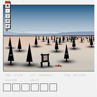
Anyway - there are still some interesting galleries to browse. My favorite is Arthur Roper-Newman, who writes:
"The site was originally inspired by the way ant colonies work, where orders derive from the base up. The many stories I had written became the basis for events within the colony, and it just grew from there. I hope this ongoing environment inspires people or makes them think when they view it."
Saturday, November 6, 2004
MSN Spaces

With MSN spaces, Microsoft have caught onto blogging for real. I have been following their employee bloggers (Hi Scobelizer! ) with interest - they seem to have been granted a license to do pretty much to do and say what they want on their blogs. Last week, I discovered that even some of their recruiters keep blogs - Heather has a very interesting post about why recruiters don't blog - and Gretchen and Zoe 's blog Technical Careers @ Microsoft contributes to giving Microsoft a fun, warm image. Looks like they love their jobs!
You've got to wonder though... how much time of their work days do they spend on blogging?! Heather mentions that "A blogger that is committed to not only post regularly, but also to read other blogs, write comments, track links and respond to people that contact you (for me, I estimated this as 30 min to 2 hours a day)."
Wow. Wish I'd get paid to blog my job, too..
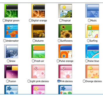
Anyway - I was interested in seeing how their spaces for people like you and me was designed. MSN Spaces offer a lot - except control over your templates! Power to the user here translates to publishing power - not design power... Check out the screen shoot - their templates are pretty cheesy. Microsoft isn't known for pretty, but they didn't need to compensate for this with what seems to be aimed for color hungry teenagers... I took a test drive and here is what my MSN blog ended up looking like.
... .perhaps I should keep this blog, and post anonymously so I can set Madison up for a joke? Come to think of it, she'd love these happy looking templates - just her style.
Monday, November 1, 2004
Playground Blues
Zeldman is fond of the design of Nathan Paul Borror's weblog, Playground Blues.
Sure, it looks like a weblog. It is a weblog. And the color scheme sort of shouts "I am naive", until you notice the detailing. The design is holystoned, and then buffed, and then polished some more.
Cindy really likes the mouseovers, though do they really need to track mouse movement? Does the moving popup help us in some way, or is this just showing off?
READ TEKKA!
ABOUT THIS BLOG
Interesting idea?
Monthly Archives:
December 2004
November 2004
January 2005
March 2005
April 2005
Categories
- Anecdotes (35)
- Art (4)
- Design (4)
- Events (16)
- Fiction (4)
- Film/TV (1)
- Hypertext (5)
- Jobs (2)
- Media (36)
- Reading (9)
- Tinderbox Troll (4)
- Weblogs (4)
Tinderbox
This site is powered by Tinderbox.
Tinderbox is the tool for notes. Give it a try!
